검색결과 리스트
Graphics에 해당되는 글 24건
- 2010.04.13 How to Set a Text-only Logotype
- 2010.03.16 Web Design Trends for 2010
- 2010.01.14 4개월 프로젝트..
- 2009.12.16 일을 한다는것
- 2009.09.21 크레용 신짱...
- 2009.07.07 Name of Love...Forever
- 2009.04.29 피오피 음영넣기
- 2009.04.29 피오피작업용지별 특성
- 2009.03.25 컬러코디네이터 1급
- 2009.02.11 STAEDTLER® ergosoft® 24색
글
 Every word has a natural pattern Before setting type, take a visual inventory. Even handwritten, we can see a descending g loop and repeating a’s, which form a trio of roundish shapes more or less in the middle. Nagano starts with an angle (N) and ends with a circle (o), both of which have open ends that lead the eye outward. It has six letters. Visually, Nagano is an average word. It’s easy to say (NOG-uh-no), and it has strong Japanese associations. These qualities will form the foundation of our designs. |
1: A Logotype Starts with the Alphabet
Letters have distinct shapes. Get familiar with these shapes. Each has its own kind of expressiveness. The shapes will also determine what you can do with your design.
The typeface Avant Garde (shown here), which consists mainly of simple straights and generous circles, is especially good at revealing letter shapes.
 |
2: For Example...
A word’s pattern can be expressed rhythmically. Rhythm is an unseen factor that affects how we perceive a word. The name j.jill consists solely of straight letters that do not convey softness like round letters do. Conversely, round pod is not naturally sharp and edgy.
 |
3: Find Your Pattern
Start by setting your name in uppercase and lowercase, and notice the pattern that forms, even if it’s subtle. Pay special attention to repetitive lines and shapes.
Nagano in uppercase Futura Book has two groups of mirrored angles (NA-AN) alternating with two round letters, a rhythmic but subtle pattern. Lowercase Avant Garde forms a line of all-round letters, a strong and interesting pattern.
 |
4: Pattern Breakers
Your name in some typefaces will not form a pattern. Letters that look alike in Avant Garde look different in Adobe Garamond, and the pattern disappears. The g that before was a circle is now a snaking, twisting line. As a rule, the more detailed the typeface—details include serifs, terminals, filets, varying stroke widths, and so on—the less visible the pattern will be.
 Texture Patterns are big. When repetitive elements are small (common in detailed typefaces like Adobe Garamond), they make texture. Above rights, you can see four circular counters and other repetitive shapes in the middle of the word. |
5: Pattern Makers
Your name can be given a pattern by the typeface. Pattern-making is the main function of most decorative type.
Calligraphic Sloop has a strong, graceful pattern—its letters arc and flow smoothly from thick to thin and have common angles and loops. Extra swashes&mdashnotice the N—create similarity with other letters where none exists naturally. Any word set in Sloop will automatically have a pattern and be beautiful.
 |
Shape Makers
Similarly, your name can be forced to take shape. The two easiest techniques are expansion—spread your name out—and compression—squeeze it together.
 Expansion Spreading your name way out disconnects its letters from each other. This breaks whatever pattern may be present and creates a new one—a neat row of dots. The panoramic result conveys a sense of grandeur both understated and elegant. It’s very popular in movie titles. The technique works with almost any typeface; set all caps for the cleanest line. |
 Compression Conversely, setting your name in a highly condensed typeface, then packing it tightly together, yields a dense, powerful block. This technique is also popular in the movies, because it can convey a massive, overwhelming presence, especially in all caps. At small sizes its dense shape carves a distinctive silhouette that’s easy to work with. |
Design a Card
So far, we’ve seen that the letters in a name can form a pattern. The typeface can make or break the pattern. The typeface can impose a pattern of its own. In every case, the typeface also adds meaning. The key to a great logotype is to find a typeface that makes the name look good and conveys the appropriate meaning.
To see this at work, we’ll next set the name on a business card in nine different type faces. The card will give us the added tools of color and layout. We will use only type, with no graphics of any kind. Pay special attention to this, and you’ll see how clearly—and beautifully—type alone can communicate.
Note: A standard U.S. business card is 3.5 x 2 inches. For this demonstration we’ll put the name on the front and ignore the contact info, which in real life would be put on the back.
| |||||||||
Excerpted from Before & After: How to Design Cool Stuff by John McWade. Copyright © 2010. Used with permission of Pearson Education, Inc. and Peachpit Press. | |||||||||
글
With a new year on the horizon, it’s time to pack away the old, worn web designs and prepare for the brave, new face of tomorrow. Although trends don’t start and stop on January 1st, there is a definite shift from what we craved at the beginning of the year to what we are seeking tutorials for at the end of the year. Most of the time, this shift is subtle. It’s a perfection or re-interpretation of a currently hot trend. Trends help us evolve as designers. As we master the skills of design aesthetic, we continue to push forward to what’s next or what needs to be fully discovered.
Make no mistake about it, you will recognize the ideas behind these trends. Although this list isn’t a drastic departure from what was popular in 2009, it marks different trends that will be expanded upon and made better as a result. As you think of how you will incorporate new trends into your designs, focus on the main idea of each trend. Be encouraged to dabble into these trends so that you become part of the movement.
1. Oversized Logos/ Headers
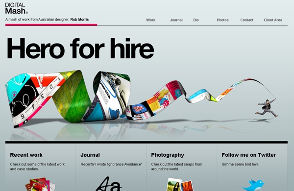
Splash pages are so yesterday. To make an unforgettable impression on the visitor, the trend for 2010 will be oversized logos on an equally oversized header. These types of headers can take up the entire screen, but with one important note. Visitors will not need to click anything, just scroll down. Visitors often having a clicking phobia (due to years of poor navigation), so big headers do the job of a splash page without forcing your visitors to click anything.
Main Idea: Huge headers that make your visitors remember you.
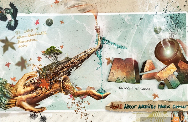
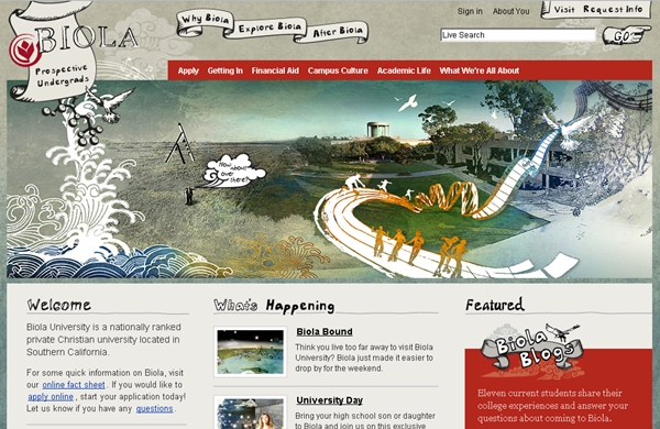
2. Sketch/ Hand-drawn Design
Hand-drawn design is not exactly new on the horizon, but we all know that it is still on the fringes of web design. Many designers admire the style but are afraid to create their own sketches because of the “I can’t really draw” attitude. If you look at the most popular hand-drawn websites (and relative to other types of trends, there are only a few), you will notice that most of your fellow designers can’t draw. These designs are not exactly headed to an art museum, but they do convey a sense of whimsy, and blur the line between cold web and personal interaction– the ultimate goal of the internet. If you can doodle, you can sketch for web design.
Sketch in 2010 will become more elemental, and not as much the main focus of a web design. It will be used to personalize standard web copy in new and exciting ways.
Main Idea: Sketch becomes an elemental part of corporate design.
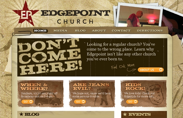
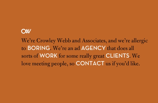
3. Slab Typefaces
Slab typefaces are relatively new, although they’ve been around for over 200 years in traditional media. To get a good visual definition of slab typefaces, think of the old Wild West “Wanted” posters. Those bold letters are slab typefaces. Slab typeface is commonly all capital letters and are bold and imposing. Many designers have shied away from slab typefaces in the past because logos and headers were smaller and more understated. However, combined with the trend toward larger headers, slab typefaces demand the reader to take notice.
Main Idea: Slab typefaces is used to bravely express who you are.
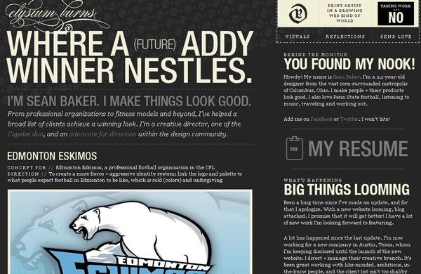
4. Typography
Typography is one of the most difficult trends to tackle which is why it will remain fresh in 2010. With all the cries for usability, web designers are afraid of using new and different fonts. The idea of mixing varying font sizes together is completely unthinkable. Fonts are meant to be explored, twisted, and molded to fit your purposes. With the correct placement, a website that utilizes Typography as its main design element will be more interesting to a reader than overloading the same site with tons of photos.
Main Idea: Typography is young, but will continue to be a part of web design.
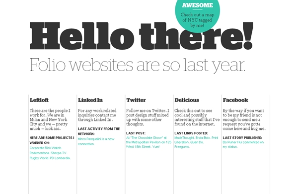
5. One Page Layouts
One pay layouts challenge you to edit away what’s unnecessary. In 2010, this trend will move away from the quirky navigation and become more minimal in its approach. Think of these websites as business cards. These websites will be more of a one-stop-shop for how to locate you and your work on various other sites– your blog and your social media hangouts.
Main Idea: One page layouts will be more about personal profiles and less corporate.
6. Huge Images
A close relative to the oversized logo/ header, the huge image does much the same thing. It creates an visual impact that the visitor won’t soon forget. Unlike the oversized header from above, huge images are not part of the site’s branding. Instead, these images draw the visitor into your site, if not for their content then for their humongous size. In 2010, web designers will find themselves more comfortable using these big statements in their design to convey the site’s tone.
Main Idea: Huge images will be used to invite visitors in.
7. Change of Perspective
As we’ve discussed before, the desktop perspective has been done to death. 2010 will see a definite change in perspective to a more realistic view. There may also be a move toward side-shot aerial.
Main Idea: 2010 will play around with different perspectives.
8. Interactive/ Intuitive Design
Flash has seen better days. There was a time when you couldn’t visit a website without running into an annoying Flash interface. These days Flash is a lot more relaxed and much more professional. Although some designers prefer jQuery for forms and popups, Flash still has its place in design, especially when done subtly. Flash still has no equal to its interactivity. In 2010, web designers will move toward the more redeeming elements of Flash. Because the average visitor is more web savvy these days, designers will also create sites that are slightly more intuitive than in the past.
Main Idea: Interactive design will make a come-back.
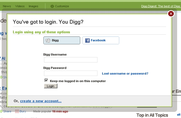
9. Modal Boxes
Modal boxes are a trend that’s picking up steam and will be virtually everywhere in 2010. A modal box is like the popup’s more sophisticated older brother– it’s smooth, good looking and popular. Modal boxes are so easy to design and easy to use, making them the perfect solution for any designer concerned with usability.
Main Idea: Modal boxes will continue to pop up in 2010 designs.
10. Minimalism
Forget the old school minimal websites. Websites of 2010 will continue to feature lots of white space but with bold typology and surprising color schemes. Not all minimal websites will agree with the notion of black and white simplicity. Although minimalism is by nature muted, it will also showcase fresh colors. Minimalism isn’t cold, it’s warm and too the point.
Main Idea: Minimalism will venture into typology.
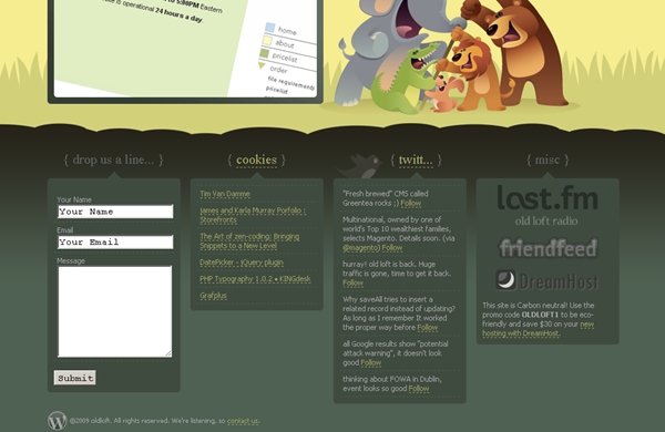
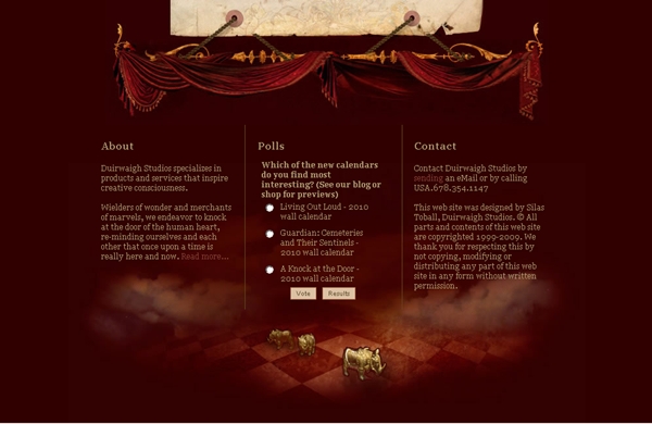
11. Oversized Footer
Oversized footers may be everywhere already, but 2010 will find them even more exaggerated. The footers of tomorrow will be less of an after-thought and more of an integral part of the design. Look for footers that feature contain random information, such as feed updates from various social media, daily polls, and Flickr feeds.
Main Idea: Oversized Footers will feature less important, but more personal information.
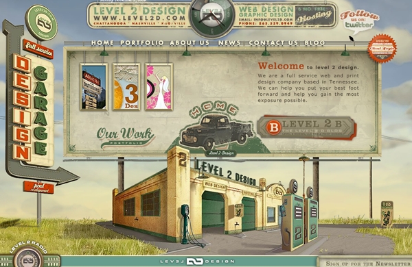
12. Retro
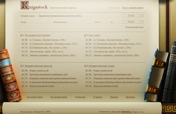
Retro designs are here to stay. Although a lot of the design community admires retro web design, it can be difficult to fully embrace this style without coming across “undone.” The key to retro designs is to be inspired by its tone and underlying playfulness. In 2010, retro design will be expanded as designers find new ways to honor vintage art.
Main Idea: Retro is new.
13. Intro Boxes
“Hi, my name is…” will find an even bigger stage in 2010 as designers recognize the beautiful simplicity of introducing yourself to your visitor. If you’re struggling with making a creative “About” page, the intro box will be your best bet. It forces you to condense who you are into a relatively small about of space. In 2010, intro boxes will push its own boundaries. Instead of the boring hello, designers will find new pick-up lines. And, instead of the left-flanked intro block, 2010 will see boxes in unusual placement, perhaps even in the middle of a page.
Main Idea: New ways to say “hello.”
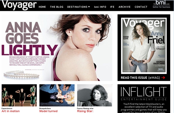
14. Magazine Layouts
As more and more people migrate from the comforts of traditional press to online infotainment, designers are challenged to welcome them in with an easy transition. There is a move toward the magazine layout, where information is carefully organized on a single home page, giving the visitor an opportunity to explore as interested. The familiar layout will appeal to appeal to anyone who’s ever read a magazine or newspaper, but it will also be easier to use– no flipping pages! In 2010, magazine layout will become very huge for blogs in particular.
Main Idea: Magazine layouts will be used for infotainment sites.
글

한달에 5만원씩 4개월이면 살 수 있다....2,3,4,5월..여름되기전에 가질수 있다..반드시!
글

그러나 결정적인 순간에 최고의 모습을 보여줄려면 부단한 연습과 과정이 필요하다
가장 중요한건 그런 연습의 결정체가 바로 발현되야하는 문제이다.
결정적인 순간을 피하거나 연습처럼 해버린다면 소용없다
모든건 최고의 1분을 향해 준비하는것이니까
과정을 즐기면된다는건 연습을 게을리하지말라는 이야기일뿐이다
한방의 힘을 원한다면 뭔가 해야할 순간에 딴생각을 품어서는 안된다
글
요즘은 이런 뉴스를 자주 접하니까..이상하지도 않은...ㅠ

이렇게 귀여운 만화를 그리셨으니 좋은데 가시길 바랍니다.
作者の臼井儀人さん..
글

글
피오피글씨체는 전체적으로 부채꼴 모양을 유지하면서 작업할 것을 지난주에 언급한바 있다.
자간과 행간이 가까울수록, 겹쳐 쓸수록 큐트한 느낌을 주며 겹친 부분은 테두리를 칠 때 경계선을 표시해줌으로 더욱 입체적인 효과를 나타낼 수 있다.
테두리는 두 가지로 나타낼 수 있는데(각 테두리.둥근 테두리) 먼저 각 테두리부터 살펴보자.
각 테두리를 하느냐, 둥근 테두리를 하느냐에 따라 음영과 하이라이트의 표현법도 달라진다.
한 장의 평면피오피를 작업할 때 물감의 색은 4~5가지 정도로 선택하는 것이 바람직하다.
너무 여러 가지 색으로 작업을 하다보면 피오피 본래의 주제를 부각시키기 보다는 보는 이로 하여금 조잡하단 느낌을 줄 수 있기 때문이다.
하이라이트(포인트)또한 하나 둘 꾸미다보면 이쁘다는 생각에 자꾸 꾸미게 되는데 이 또한 심플한 느낌을 줄 수 있도록 최대한 자제하여 꾸며주도록 한다.
A. 사용재료 ; 4절 매직터치, 포스터칼라, 평붓, 둥근붓, 물통, 신문지등
* 4절 사이즈 ; 일반 신문지를 완전히 펼쳤을 때 한 면의 크기와 동일(가로54*세로39정도)
B. 제작과정
1. 4호 평붓으로 타이틀 문구 작업
* 타이틀 문구에 적합한 색상은 밝은 색을 선택한다.진한색상 선택시 테두리의 효과가 없기 때문이다. 진한 색상계열은 타이틀문구 외에 부연설명글에 적합하다.(진보라, 남색, 검정등)
|
2. 1호 평붓으로 테두리 작업 후 겹친 부분의 경계선은 2호 둥근붓이나 마카펜의 뾰족한 부분으로 살려준다.(자음과 모음이 겹칠 경우엔 자음을 살려주도록.)
* 물의 농도를 너무 많이 하면 묽어짐으로 미리 써놓은 글씨를 망칠 수 있다. 물감과 물의 비율은 1:1 이 적합하다. 일정한 굵기로 글씨를 침범하지 않으면서 테두리 작업을 한다.
|
3. 음영표현
*입체적인 표현을 돋보이기 위해 트위마카의 사각촉을 이용하여 같은 계열의 색상으로 음영을 표시해준다. 전체적으로 왼쪽상단에서 빛이 비추었을 때를 기준으로 표현한다.
|
4.하이라이트 표현하기
* 흰색으로 포인트 작업을 한다. 검정색으로 메꿔진 부분은 심플한 느낌이 들도록 간단한 문양을 그려 넣어주면 효과적이다. 각 글자마다 1~2군데 각의 느낌이 살도록 음영을 넣었던 반대쪽에 ⌜ 표시로 표현해준다.(하이라이트표현시 흰색의 농도는 조금 진해야 한다)
|
5.반짝이 풀로 표현하기
시중에 색색가지 반짝이 풀이 다양하게 출시되어 있다.
농도의 배합이 잘 된 것을 선택하도록 한다. 너무 묽은 반짝이 풀은 작업을 할 수가 없다.
글자마다 모두 반짝이 작업을 하는 것은 금물! 예쁜 글씨를 한층 돋보이게 하는 역할을 한다.
|
6.1~6번을 이용한 완성 피오피물 예시
* 포스터피오피 디카 촬영방법 ; 코팅을 하기 전 같은 눈높이에서 후레쉬를 켜지 않은 상태에서 촬영한다.
|
글
2. 머메이드지 - 수입지이며 매직터치보다 조금 비싸다.
양면으로 엠보싱이 들어가 있으며 디테일한 테두리 작업등을 하기엔 초보자들은 힘들 수 있다. 질감은 매직터치와 비슷하다.
3. 디자인색상지 - 국산지이며 일반적으로 형광용지라고 부른다. 물감의 양이 너무 적거나 많은 경우에 물감이 깨져서 떨어져 나갈 수 있는 단점이 있어 꼭 코팅을 해줘야 한다. 종이감도 얇으며 4절 크기만 판매된다. 눈에 띄는 색상이 많아 선호하기도 하지만 싼티가 나기 때문에 근래에는 잘 사용하지 않는다.
4. 디자이너스지 - 수입지이며 색상이 매우 세련되고 다양하게 출시된다. 가격이 비싼편이며 종이가 아주 얇아 작업후 반드시 코팅을 해줘야 한다.
5. 모조지 - 흰색 종이는 모조지 작업도 무방하다. 두께는 매직터치정도이며 머메이드지보다 저렴한 편이다.
글
컬러코디네이터 검정시험은 1,2,3 급으로 나누어져 있으며
2, 3급에서는 색채학적인 지식에 대한 내용,
1급 에서는 3가지로 분류된 (제품, 환경, 패션) 각 분야에 관련된 주변지식과
색채지식을 바탕으로 각 분야의 색채계획시 유념해야 하는 여러가지들에 대한 내용이 있습니다.
현재 한국에서의 1급시험은 환경분야가 2007년부터, 제품분야가 2008년부터 시행되고 있으며
패션분야는 2009년 도입예정에 있습니다.
1급시험에는 논술시험이 포함되어 있으며, 논술 문제는 2문제로 각 10점과 25점의 배점입니다.
10점 논술문제에서는 2, 3급의 내용에 해당하는 색채지식에 관한 문제가 출제되며
25점 논술문제에서는 1급에서 공부한 내용에 대해 묻는 문제가 출제됩니다.
일본 도쿄상공회의소 주최 컬러코디네이터 1급 3개(제품,패션,환경색채)과목의
검정시험 시행은 1년에 1회씩 시행되며, 시행시기는 매년 12월에 시행됩니다.
1급 3개(제품,패션,환경색채)과목의 시험응시는 1년에 1개 과목에 대해서만 응시가
가능합니다.
1급 검정시험의 출제범위는 2,3급 컬러코디네이터 지정 교과서 내용 중에서 30% 정도가
출제되며, 70%는 1급 지정교과서 내용 중 출제됩니다.
시험의 난이도는 우선 1급 교과서의 내용 자체가 분야의 전문성을 요하고 있어 시험자체도 어려운 것이 사실입니다. 일본 현지에서 컬러전문가로 활동하고 계시는 분들도 1급 검정시험의 난해도에 대해서 어려움을 토로하고 있습니다.
2,3급 자격증을 취득하지 않고 1급을 바로 응시하여 자격증을 취득하기는 거의 불가능 하다고 말씀드릴 수 있습니다.
2,3급 검정시험은 문제유형이 객관식으로 출제되지만, 1급 같은 경우는 30점 만점의
주관식 1문제가 출제됩니다. 합격점수가 70점 이상임을 감안하면 주관식 1문제의 답안이
1급 합격여부에 결정적인 영향을 끼친다고 말씀드릴 수 있습니다.
더불어 주관식 1문제 답안의 분량은 보통 A4 문서 1장 정도의 답안을 요구합니다.
예를 들어 컬러코디네이터 한국사무국에서 한국의 컬러리스트 기사 자격증 취득자 20명을 대상으로 컬러코디네이터 1급 모의시험을 개최한 결과 전체 평균이 20점 미만이었으며
주관식 구술문제에 대해서는 거의다 포기하였습니다.
컬러코디네이터 검정시험은 실기시험을 따로 보지 않지만, 필기시험 문제로 응시자의 실기능력을 판별할 수 있는 문제가 출제됩니다.
글






RECENT COMMENT